What’s the best way to show your data?
The way that helps you make sense of it quickly, the way that will support your analysis, the way that will show you exactly the data that you need.
We’ve all been there: presented with a large color set or sophisticated graphic options, we are tempted to think esthetics over meaning.
Here are a few bad examples where users got carried away.
- Too Much Information
Putting too many information on a representation makes it much more complicated to read. Data visualization should make people get the idea from the glimpse of an eye and not have them scratch their heads over it.
Our advice: Keep it simple, don’t try to convey too many ideas in one chart.
- Wild Comparisons
Stacked bar charts are an awesome way of comparing differences on a data set, however you should not sacrifice the readability of your visualization for fancy arts. In the above example, it is extremely complicated to understand the actual differences in waste management between different countries as the bars are all over the place.
Our advice here: do not sacrifice readability over a fancy representation, you won’t get your message across.
- The Wrong Scale
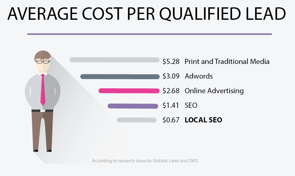
Simple bar charts are one of the most common and easiest way to represent data. However, this is only the case if you don’t mingle with its basic principles.
In this example, the bars sizes are not accurately representing the data, letting readers think that the cost of a qualified lead through local SEO is about half the cost of a lead from Print & Traditional media… however that is absolutely not the case! When you look at the data, you realize the actual number is in fact… close to 8 times higher!
Our advice here: Use the right scale or you will convey the wrong message.
And here you are! I hope those few tips will help you make more sense of your data!
Happy Dashboarding!